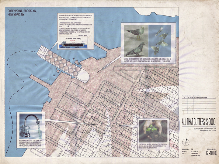
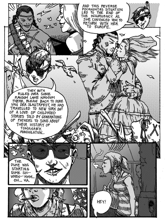
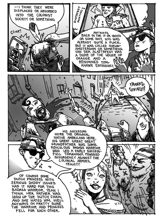
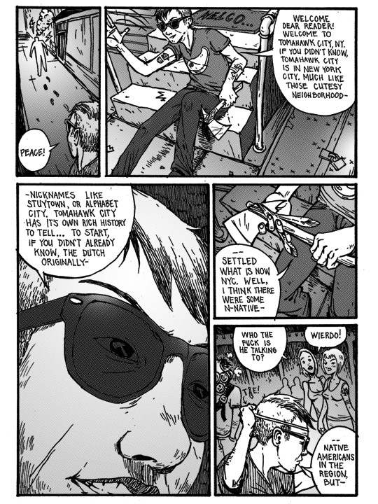
This was done last night for the glitter competition. Click image for large version.
Overall I’m very glad I took the time to do it because once it got going it was pretty fun. Glitter is a ridiculous material to use on any kind of rendering of anything. The general degeneration of my concept in the days prior was a good exercise as well. I generally ask the question of “How retarded can this become so it may possibly become the opposite of retarded?”
Another funny aspect was trying to scan/photo document the thing. I eventually settled on scanning and stitching it up in photoshop, because the text was completely illegible in photos. It looks much better in person, which is probably the case with all the entries to this competition.
Note to self, do not start working @ 6pm on a Sunday night on a spring forward weekend, especially if you have to wait for glitter glue to dry before scanning, because the next day at work will be brutal. Yesterday was brutal.
Thanks to everyone I talked to about the bad ideas I had, and even bigger thanks to everyone who somehow made them badder. I’d say I got it to about 50% of what I wanted to do. But given the outside factors involved, is a pretty good amount. I wanted to make a much more involved where’s waldo-esque drafted drawing, but it kind of ended up looking like a info pamplet or something, which is ok especially considering the time.
Update 08.11.2010: Winners
Hey, I hadn’t checked into your site in a while, sitting here laughing like crazy at the glitter. I was trying to explain your cloud/zip tie chair to some ppl the other day, and they seemed to lack the imagination required to comprehend its brilliance/ridiculousness. They wanted to use zip ties to hang things off of fences. Very logical I suppose. In any case, I’ll have to check in more often, keep up the good work.
[…] My entry. […]
TrackBack URI