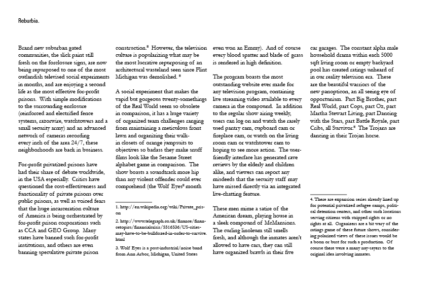
So there was a competition called Reburbia, put on by inhabitat and dwell. Very cool concept, how would you re-envision suburbia. We (the gang) had discussions, and brainstorms about the subject and ultimately couldn’t come up with anything cohesive. This is a really hard prompt. The problem started with how pragmatic should the solution be, and the question of what is suburbia. When a somewhat pragmatic approach is viewed, lets say we want mixed use within suburbia, commercial, community space, etc. And lets say we would like to add some other integrated community green space, bike lanes everywhere, integrated public transportation, and all those nice things. Well you’ve just turned suburbia into a city. And that’s where thing started to get annoying, because we realized that suburbia is and has always been about living with a “country or rural” type of life with proximity to the city. Now I don’t mean farming animals or whatever, but having a nice quiet place, without the noise and bustle of the city, but close enough to the city to work or be entertained or whatever. Most ideas about turning the suburban into the urban then seemed really silly, because a lot of people don’t like city life, a lot of people like driving cars, and a lot of people like privacy, a lot of people like having much more space for their dollar, and don’t really know or hang out with their neighbors. Which is why a lot of people live in suburbia, among other reasons. We conjured up visions of deconstructing houses to make passageways to other buildings, sinking buildings, matta-clarking buildings, using demographics as program for suburia, etc. None of which really grabbed us. Eventually I think we were burnt out on the thing, because we couldn’t decide on an answer/other obligations/timeline. (The timeline was really short, considering that it only allowed for 5 images my guess is they wanted a ton of really quick ideas on the subject, suburban wind farm, and McMansion zoo, etc.) I saw the problem with suburbia not so much with the actual cookie cutter designs, excessive and reckless use of land/space, and general blah of existence. The big problem was that people want these cookie cutter neighborhoods, excessive and reckless use of land/space, and general blah. A 5 bedroom, 5 bathroom, 3 car garage, complete with pool and manicured lawn and built in a spanish style stucco whatever is awesome to most people! People love it! Attacking or undoing the image of this suburban ideal seemed to be more useful than proposing bike lanes or windmills for the already wide ass streets. Because it seems the general populous’ suburban preference is the largest design hurdle to overcome.
As a side note, I want to eventually produce a collaborative work called Delirious Sacramento, sort of an homage to Koolhaas’ Delirious New York/funny assessment of a fairly average city in comparison. I’ve grown up in the suburbs, all my friends generally have as well, and now there is a large group of us living in the city. We all have mixed feeling about the city in general, as there are merits to both. I do think it’ll be a worthwhile long term project and working on this submission and thinking about suburbia in general was a great kick start to Delirious Sacramento.
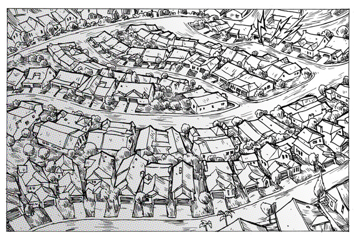
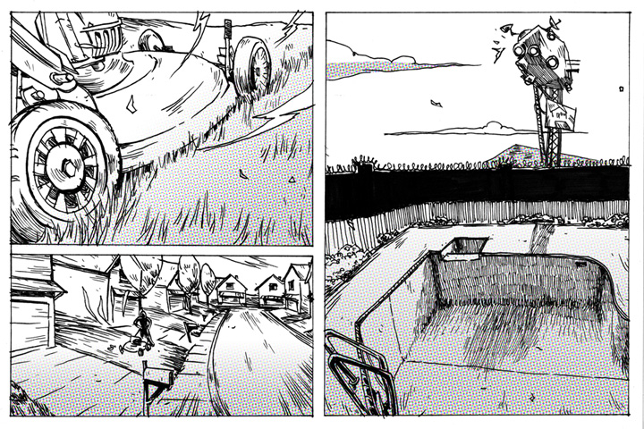
Back to the competition: At a certain point I was like fuck it, I’ll just make something fun, stemming from the idea that the suburban ideal must be subverted. This is what resulted. (BEHIND THE CUT)
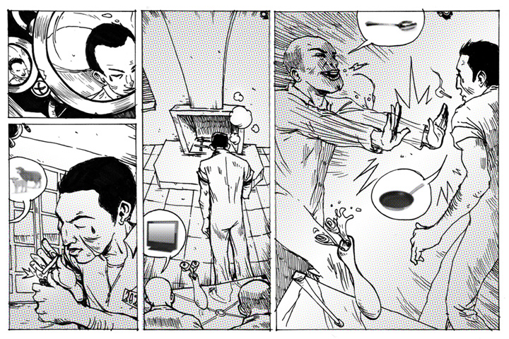
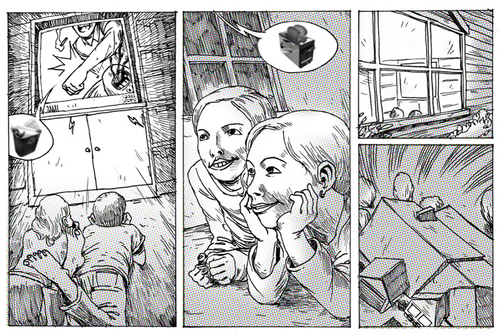
I do think I will be the only person proposing in this format. In reading BLDGBLOG BOOK, and seeing Geoff Manaugh’s attempts at architecture comics I thought I’d try my own, since I used to draw comics a lot. It’s a fun format, and I really wish I tried to do this earlier (both in general and for this competition (I know my thesis would have been a lot cooler with some little vignettes like this)). I don’t know if you can tell but the first two pages are a lot better than the last two, which were pretty rushed. But not bad considering I haven’t drawn a comic since that internet one. I sort of did the Lebbeus Woods thing where all the text is at the beginning and only images follow, with the conversations not actually using text. I think a sort of low art version of Lebbeus Woods would be a cool concept to persue. In making the entry I was also reminded how much I miss making comics, and I really should make them more often for the heck of it.
I know if I’m releasing these images before they actually pick a winner, but I doubt I’ll win anything and will gladly temporarily take these down if it’s in some kind of violation of rules (which I don’t think it is)


I want to talk about your post a little more later, but have you seen any other “architecture comics”. I tended to an exhibition at the LA Forum of Wes Jones’ Meet the Nelsons, a rather high brow comic of architecture in the early nineties, referencing derrida et al. in a setting of surreal slice of life suburbia. there’s also some pretty great architecture comic work on archinect but I couldn’t find it again, and some super random ones here http://www.bigheadpress.com/thearchitect and here http://minisuck.comicgenesis.com/d/20060517.html…
TrackBack URI